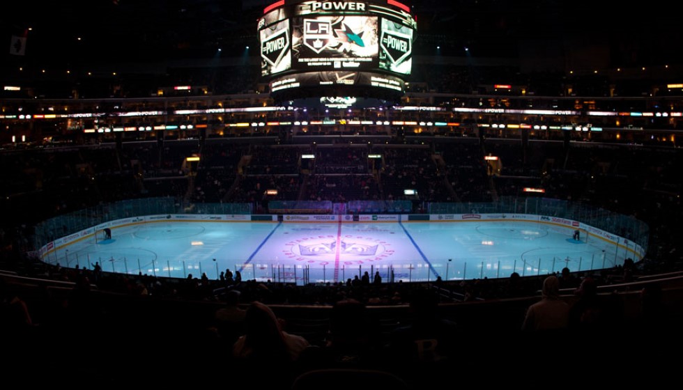
The Los Angeles Kings have unveiled a new logo that pays homage to the heyday of the 1990s Gretzky era. This updated emblem seeks to bridge the storied past of the franchise with its present and future ambitions, resonating deeply with fans of all ages.
Reviving the Chevron Design
Wayne Gretzky's tenure with the Kings left an indelible mark on the team’s branding. The new logo revives the iconic "Chevron" design from Gretzky's era, encapsulating the essence of a time when the Kings were a dominant force in the NHL. This revival serves not only to commemorate historic moments but also to connect them with future possibilities.
Incorporating Historic and Modern Elements
The redesigned logo prominently features the word "Los Angeles" at the top, emphasizing the team's strong connection to its home city. Additionally, an updated version of the original 1967 crown is also included, tying the modern design to the franchise's rich history.
The new logo is a thorough reimagining of elements from the early 90s jerseys, blending classic and contemporary styles to create a symbol that reflects the evolution of the team. This new design replaces the previous logo which was introduced in 2008, marking a significant shift in the team's visual identity.
A Two-Year Collaborative Effort
The development of the new logo was an extensive two-year project that involved considerable collaboration and effort. Luc Robitaille, who played a key role in the process, highlighted the extensive effort and collaboration involved in creating the new emblem. The design process also gathered feedback from both past and current players, ensuring that the logo resonates with a wide audience.
Organizational Pride and Fan Engagement
Kelly Cheeseman, another influential figure in the team, remarked on the pride felt throughout the organization about the new logo. The redesign honors the past while appealing to today's audiences, ensuring that fans old and new can connect with the team's legacy.
New Era of LA Kings Hockey
The new logo will be available for purchase starting Friday, June 21, at the Crypto.com Arena's Team LA Store. The launch is expected to be celebrated by fans who are eager to embrace this new chapter in the franchise's storied history.
The logo's design, which fuses classic and modern elements, aims to create a lasting connection with the fanbase while paving the way for future iterations and extensions. It symbolizes a fresh beginning for the Los Angeles Kings, further cementing the franchise's commitment to honoring its past while looking forward to future successes.
Quotes from Key Figures
"This has been an extensive and collaborative process, and we are thrilled to roll this out to our fans and the city of Los Angeles," said Luc Robitaille. "This evolution is rooted in our 57-year history and embraces the elements of our eras."
He added, "It also involved interface and feedback with players both past and present, and it sets the stage for extensions and new iterations in the future."
Kelly Cheeseman also expressed his excitement and pride, stating, "From ownership to our players, our organization is proud to usher in a new era of LA Kings Hockey. We are excited for our fans to be part of this with us."
The launch of the new logo marks a significant milestone for the Los Angeles Kings, reinforcing their storied history while looking ahead to future triumphs. Fans can look forward to not only wearing the new emblem with pride but also witnessing the continued evolution of a team deeply rooted in tradition and poised for future greatness.